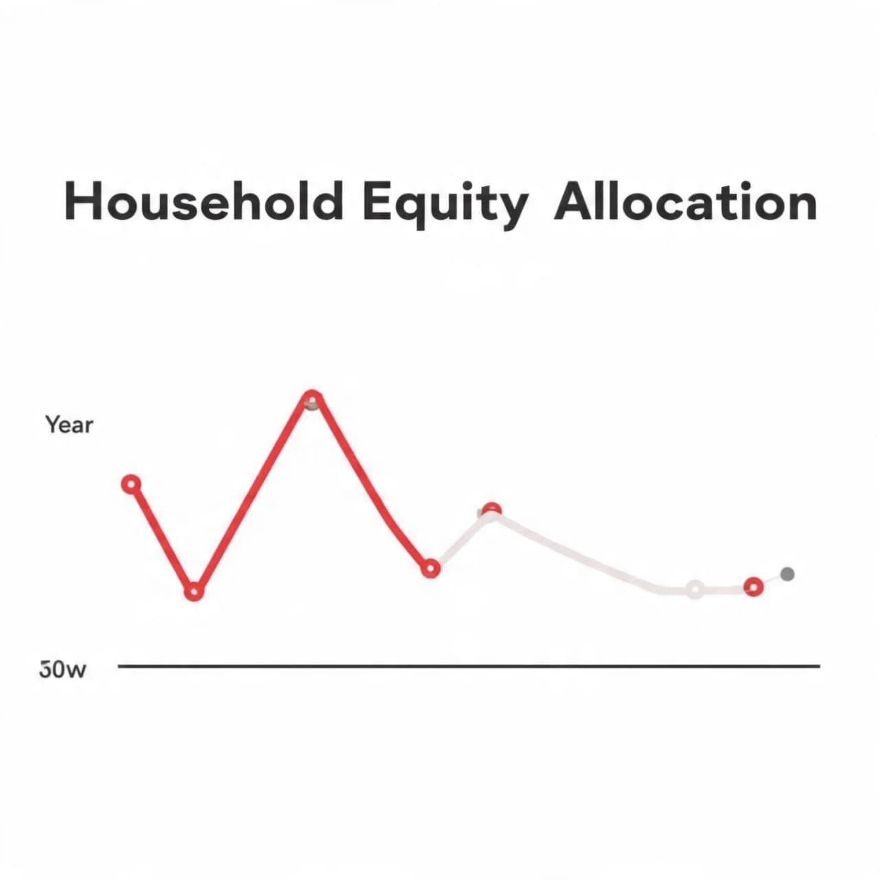
There are times when a single line on a chart feels less like a statistic and more like a quiet pause in a long conversation. It does not shout or demand attention. Instead, it waits, inviting reflection. Recently, one such chart — often described as the single greatest predictor of long-term stock-market returns — crossed into territory it has never reached before. The moment feels less dramatic than contemplative, like standing at the edge of a familiar shoreline and noticing the tide resting higher than memory recalls.
This chart tracks the share of household financial assets invested in stocks, a measure rooted not in forecasts or opinions but in revealed behavior. Over decades, it has quietly reflected how confident households feel about equities relative to other assets. When stock exposure has been low, future returns have often been generous. When exposure has been high, long-term returns have tended to soften. It is not prophecy, but pattern — a mirror held up to collective optimism.
Today, that mirror reflects an unprecedented image. U.S. households now hold a larger share of their financial assets in equities than at any point on record. The line on the chart does not merely approach past peaks; it moves beyond them. This shift does not signal an imminent turning point, nor does it insist on immediate action. Instead, it suggests that expectations are elevated, that confidence has become deeply embedded in portfolio choices across the economy.
Historically, this measure has shown a strong relationship with subsequent ten-year real returns for the broader market. When equity exposure has climbed to extremes, future gains have often arrived more slowly, shaped by valuation gravity rather than momentum. Yet even now, the chart offers no deadlines and no certainties. Markets have a way of lingering in unfamiliar places longer than models anticipate, sustained by innovation, earnings growth, and evolving financial structures.
What makes this moment distinct is not alarm, but novelty. Never before has this indicator rested at such a level while economic conditions, interest rates, and global capital flows look as they do today. That combination adds nuance rather than clarity. It reminds observers that while history can guide, it does not repeat itself neatly, and that context matters as much as correlation.
The broader market environment continues to hum with activity — corporate profits, policy expectations, and technological shifts weaving together in real time. Against that backdrop, this chart serves as a quiet counterweight, encouraging patience and perspective. It does not contradict optimism, but it gently tempers it, suggesting that future returns may rely more on discipline than enthusiasm.
In straightforward terms, the data shows that a long-respected valuation indicator based on household equity ownership has reached an unprecedented level. Analysts note that, historically, such readings have been associated with lower long-term market returns, though short-term outcomes remain uncertain and dependent on broader economic conditions.
AI Image Disclaimer
Images in this article are AI-generated illustrations, meant for concept only.
---
Sources
MarketWatch Federal Reserve Barron’s The Wall Street Journal Bloomberg
Published by Banx Network. This article is part of the Banx decentralized media programme, powered by the BXE token on the XRP Ledger.