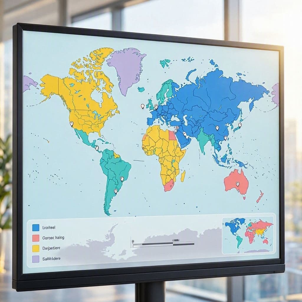
For centuries, the Mercator projection has shaped our understanding of the world, presenting a familiar but distorted view of geography. It enlarges regions near the poles, making Greenland appear comparable in size to Africa, when in reality, Africa is fourteen times larger. A new interactive map challenges these perceptions, inviting users to guess the true sizes of countries. This educational tool serves as a gentle correction to a long-standing visual bias, offering a more accurate perspective on global proportions.
The distortion in traditional maps is not a mistake but a mathematical necessity for flattening a sphere onto a plane. However, this convenience comes at the cost of accuracy. The new map uses an equal-area projection, ensuring that the relative sizes of landmasses are preserved. This shift allows viewers to see the world as it truly is, rather than how it has been conventionally represented.
Users of the new map often express surprise at the results. Countries in the Global South, often minimized in traditional views, are revealed in their true magnitude. This realization can have profound implications for how we perceive global power dynamics, resource distribution, and cultural significance. Size, after all, often influences our subconscious judgments about importance.
Educators are embracing this tool as a way to teach geography more effectively. By engaging students in a guessing game, the map makes learning interactive and memorable. It encourages critical thinking about the sources of information we rely on and the biases they may contain. Understanding map projections becomes a lesson in media literacy and scientific accuracy.
The technology behind the map is simple yet powerful. It allows for seamless comparison and visualization, making complex geographical data accessible to everyone. Whether on a smartphone or a desktop, the experience is intuitive, inviting users to explore and discover. This accessibility ensures that the message reaches a broad audience.
Beyond education, the map fosters a sense of global equity. By accurately representing all nations, it validates the presence and scale of every country. This visual fairness can contribute to a more inclusive worldview, where no region is inadvertently diminished by cartographic convention. It is a small step toward a more balanced understanding of our planet.
As more people engage with the new map, the conversation about representation grows. It reminds us that even the most fundamental tools of knowledge are subject to interpretation. By questioning the familiar, we open ourselves to new truths and a deeper appreciation of the world’s diversity.
The new world map offers a fresh and accurate perspective on global geography, challenging old distortions and encouraging a more informed view of country sizes. It is a valuable tool for education and reflection, promoting a fairer understanding of our world.
AI Image Disclaimer: Visual representations of the map concepts are generated by artificial intelligence for editorial context.
Sources: National Geographic The Guardian Scientific American
Published by Banx Network. This article is part of the Banx decentralized media programme, powered by the BXE token on the XRP Ledger.