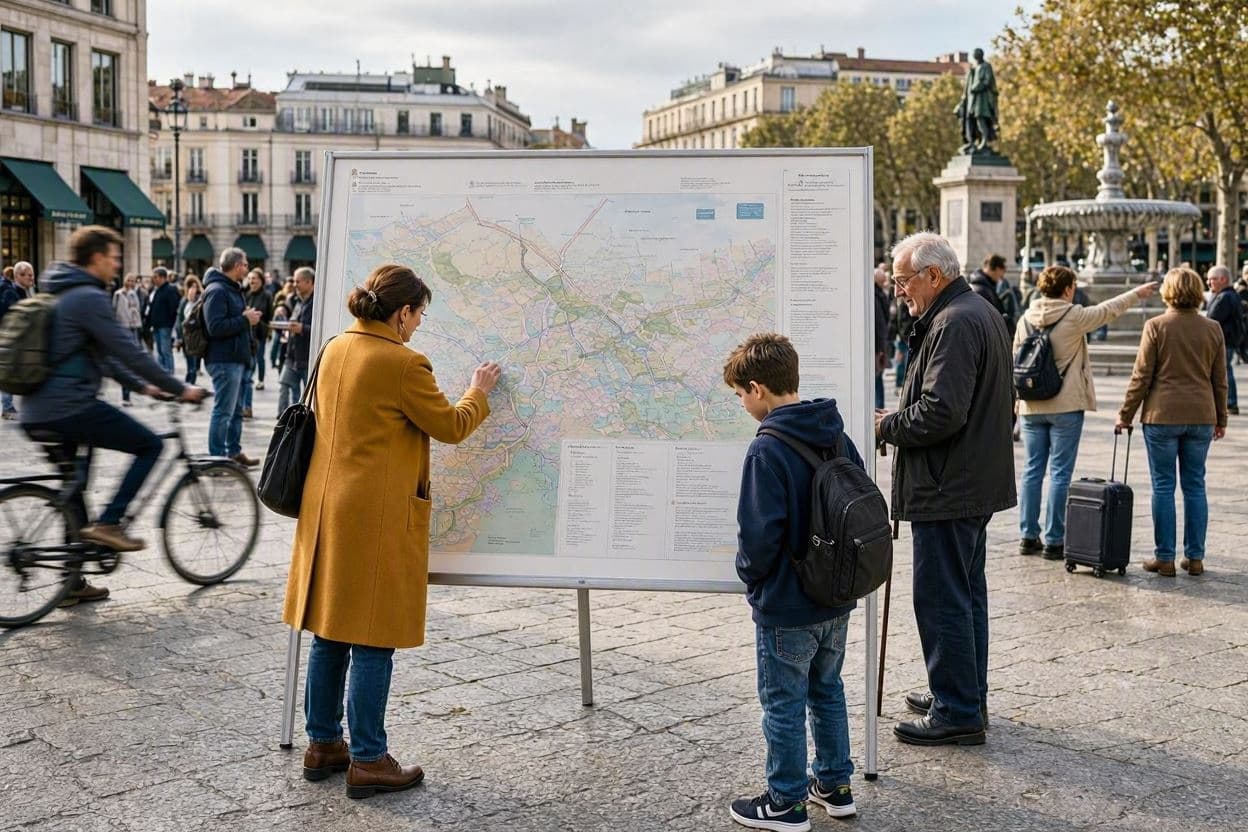
In an era dominated by sleek digital interfaces and real-time GPS navigation, there is a nostalgic charm to the printed map. MapQuest, a pioneer in online mapping, has embraced this sentiment with a whimsical marketing campaign that celebrates the tangible nature of direction. By posting giant, old-school printed directions to Lake Ontario in Toronto and other cities across the United States, the brand is reminding us of the joy found in physical guidance and local exploration.
The campaign features large-scale installations that mimic the classic printouts MapQuest users once relied on before smartphones took over. These oversized sheets, complete with turn-by-turn instructions and familiar fonts, are displayed in prominent public spaces. They serve as both art and advertisement, inviting passersby to pause and reflect on how technology has changed the way we navigate our world. The choice of Lake Ontario as a destination highlights the beauty of local landmarks and the simplicity of getting there.
For many, the sight of these giant printouts evokes memories of road trips past, where planning was a collaborative effort involving paper maps and highlighted routes. There was a certain ritual to folding and unfolding the pages, tracing the path with a finger, and anticipating the journey. MapQuest’s campaign taps into this collective memory, creating a bridge between the digital present and the analog past. It is a playful nod to the brand’s heritage and its role in shaping modern navigation.
Beyond nostalgia, the campaign encourages people to engage with their surroundings in a more mindful way. Without the constant voice of a GPS assistant, drivers and pedestrians might notice more details along the route—the architecture, the parks, the people. Slowing down to read a sign or follow a printed direction can transform a commute into an experience. It invites a slower, more deliberate pace of life in a fast-paced world.
The installation in Toronto, specifically near Lake Ontario, underscores the city’s connection to its waterfront. Lake Ontario is a source of recreation, beauty, and cultural significance for residents. By directing attention to this natural feature, MapQuest promotes local tourism and appreciation for urban green spaces. It suggests that sometimes the best destinations are those closest to home, waiting to be rediscovered.
In U.S. cities, similar installations have sparked conversations about the evolution of technology. From bulky CD-ROMs to cloud-based apps, the tools we use to find our way have become invisible yet indispensable. MapQuest’s return to print is a ironic yet effective way to stand out in a crowded digital marketplace. It reminds consumers that behind every algorithm is a human desire to connect and explore.
Critics might argue that printed directions are obsolete, but the campaign is not about utility so much as emotion. It is about the feeling of reliability and the comfort of having a plan in hand. In a world where data plans fail and batteries die, there is still something reassuring about paper. It is a testament to the enduring value of simplicity and clarity.
As the campaign continues, it invites everyone to take a different route, whether literally or metaphorically. By doubling down on Lake Ontario and other local treasures, MapQuest is celebrating the journey itself. It is a reminder that no matter how advanced our technology becomes, the joy of discovery remains timeless.
AI Image Disclaimer: The illustrations for this article are AI-generated to visualize the concept of oversized printed maps and urban installations, using descriptive and artistic imagery rather than real photographs of the campaign.
Sources: Marketing Magazine, MapQuest Blog, CBC News, AdWeek
Published by Banx Network. This article is part of the Banx decentralized media programme, powered by the BXE token on the XRP Ledger.